
This is a photo that i increases the hue to make it this color. I originally added curves to the light and dark would look god. Then i did a color balance. After i added a green hue. This looked cool with the sun so i took the picture decreasing the amount of light coming in.
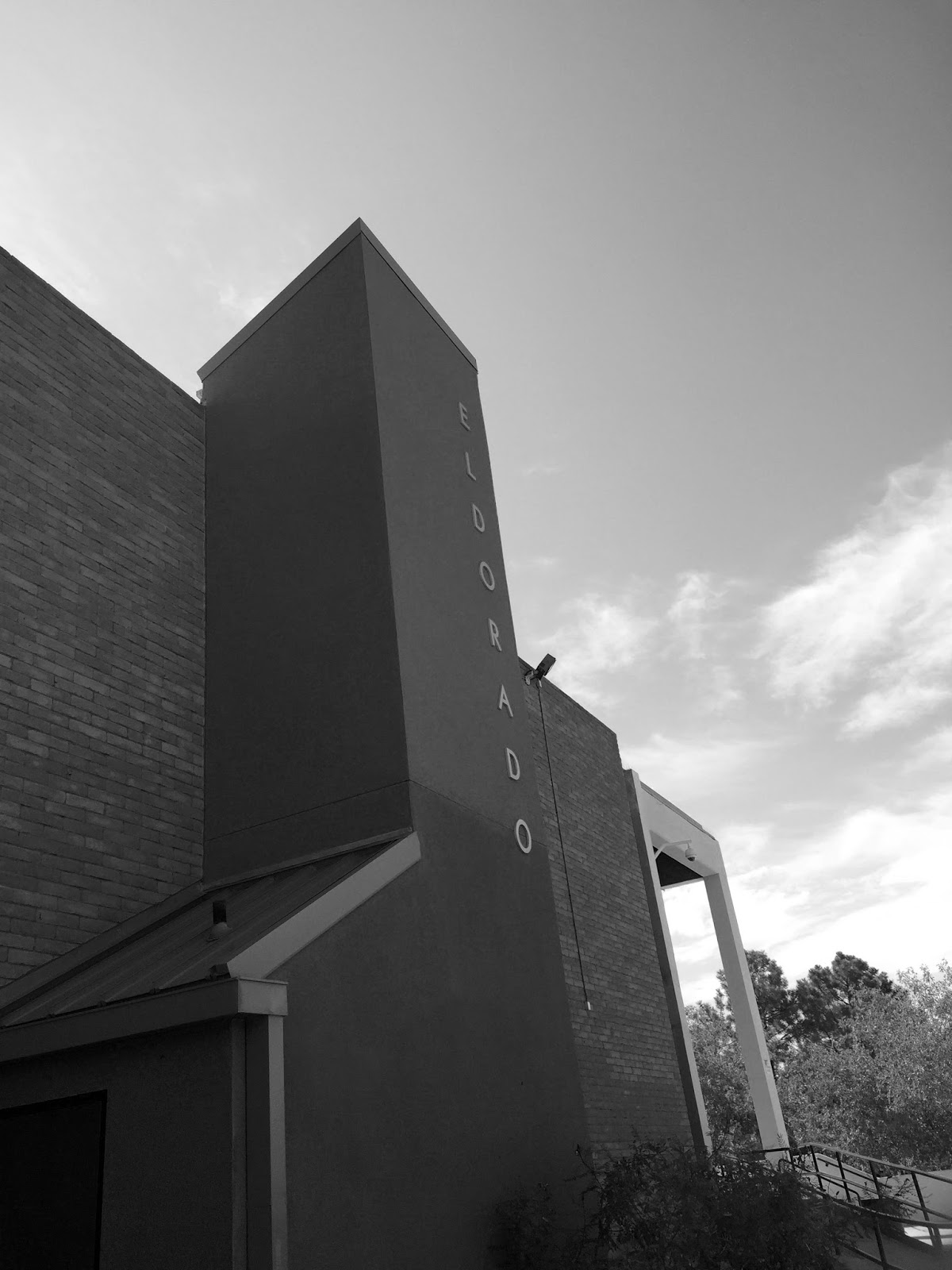
This photo i made black and white. I did this because it seemed better to make it look older. This looked better because the colors did not go well with each other. i took this photo because it shows a specific form of the building and the letters.

This photo I decreased the light to make the shadows darker. I did this to emphasize the trees and the sun shining on them. I took this in the courtyard. I took this because it had a good angle on the trees hanging over the patio.
No comments:
Post a Comment